
What Is It?
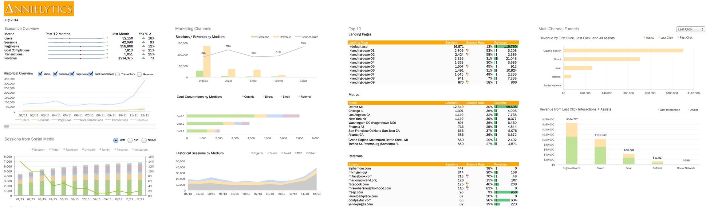
The Annielytics Dashboard Seminar was originally a three-day seminar that — due to pretty outrageous demand from marketers who couldn’t travel to a seminar — is now a 16-hour online course that will teach you how to leverage the Google Analytics API to create sexy reporting dashboards in Excel like the one below:
Whereas most seminars take more of an academic approach to Google Analytics (which I’ve personally benefited from tremendously), this course takes much more of a hands-on, soup-to-nuts approach to teaching marketers what to report on, how to dynamically pull the data straight into Excel, and how to create compelling visualizations in Excel using all kinds of Excel wizardry. But I break the concepts down in the simplest of terms so that even someone totally new to Google Analytics or Excel could follow along. For example, I know how intimidating it can be to understand how to use the INDEX formula to build out dynamic visualizations, so I explained how it works using a sleeve of Saltines.
Basically, any concept that was more difficult for me to grasp in my early days was treated with special care to ensure attendees (and now subscribers) have a fighting chance at really mastering the skills needed to put me out of work ramp up your skill set as a marketer. I was actually jealous of attendees. I had attendees in their twenties walk away with skills that took me seven years to learn! Punks. 🙂
Seriously, these skills will set your LinkedIn profile on fire. Do you know how desperate companies are for marketers who can walk into a job and be able to help them make sense of their data? Throw in experience with the Google Analytics API and the ability to create dynamic charts and pfft … Potential employers will be fighting over you. (And anyone who has followed me knows that I’m not given to exaggeration.) Finally, I teach the course using Excel 2013, 2011 (for Mac), and 2010, so no Mac user will be left behind! I literally have Windows installed on my Mac and cycle through the steps in each version of Excel.

Table of Contents
My Sojourn
Testimonials
Video
More Dashboards
Curriculum
Pricing
Technical Details
Dashboard Only
My Sojourn
The bane of most marketers’ existence is proving the effectiveness of their work. I remember all too well, in my early days as an in-house analyst, the utter frustration of taking screenshots and exporting PDFs from Google Analytics (hey, don’t judge!) and trying to tell a story decision makers would find compelling. That frustration eventually hit a critical mass, leading me to read every Excel book I could get my hand on and watch every Excel video I could find on Lynda.com and YouTube to learn how to massage data and make it compelling. And dare I say sexy? Yes. Yes, I dare. 🙂
I’ve made it my mission to provide as many resources as is humanly possible for other marketers and analysts who face the same frustrations I have had to scale. Some of these include my Google Analytics campaign tagging guide, my Hundreds of Tools for Marketers resource, and my massive audit checklist doc. And my blog has also been recommended by Google itself as a useful resource for marketers and analysts.
Have you checked out @anniecushing's blog before? Lots of useful posts on Analytics. Explore them here: http://t.co/2GLyKXMKPQ
— Google Analytics (@googleanalytics) February 27, 2014
By the time you get to the end of this course, you will have a solid grasp on how to work with Google Analytics to tell the story your data is dying to tell. And you’ll have starter dashboards to work with and modify. I even show you insanely cool tricks, like how to replicate Google Analytics’ amazing Channels report.I reverse engineered it and show you how to do the same so that you can apply that glorious report to data before July 2013 (this is not possible through the UI). But enough about what I say; let’s hear what attendees who’ve taken the course had to say about it.
Testimonials
Hear what others who have taken the course have to say about it …
 Despite my love of data, I’m unable to quantify the immense value I derived from Annie’s Dashboard Course. As I write this, my copy of the course’s workbook is open next to me to help me apply yet another sexy technique to my workflow!
Jessica Commins
Executive Vice President of Operations Copyblogger
![]()
![]()
 Annielytics is a PRO!!! I was so impressed with Annie’s Dashboard Seminar! Not only did I get a more in-depth knowledge about Excel, but gained way more insight on how to look at data. Whether you’re new to analytics or an old hat, this course is for you.
Victoria Edwards
Digital Content Strategist Florida Blue
![]()
![]()
 Annie’s dashboard course is essential for any marketer that wants to use Excel to prove their value. Annie teaches you the basics to make data look pretty and convince your clients or leaders in your company that what you are doing is working.
Benjamin Rudolph
President & CEO Relevance Advisors
Videos
Below is a short overview of some of the skills you will learn in the course.
You can also check out this video walkthrough of the template you’ll be building of the dashboard. It’s a bit busier than I would normally design, but I wanted to be able to demonstrate as many hot data visualization techniques as possible. However, you’ll receive this template in the course downloads and can modify however you want to meet your needs.
You can see a 15-minute sample of the first video by clicking any of the Learn More buttons on the pricing page. Still need more? You are a hungry little hippo, aren’t you? 🙂 Very well then. Let’s jump into the deeper waters with more specific details about the course.
More Dashboards
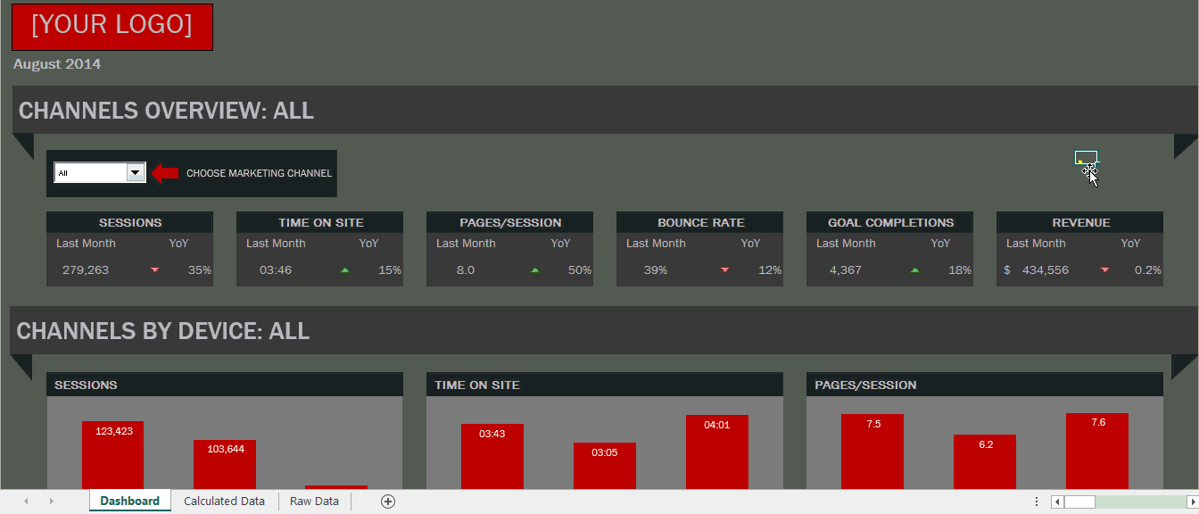
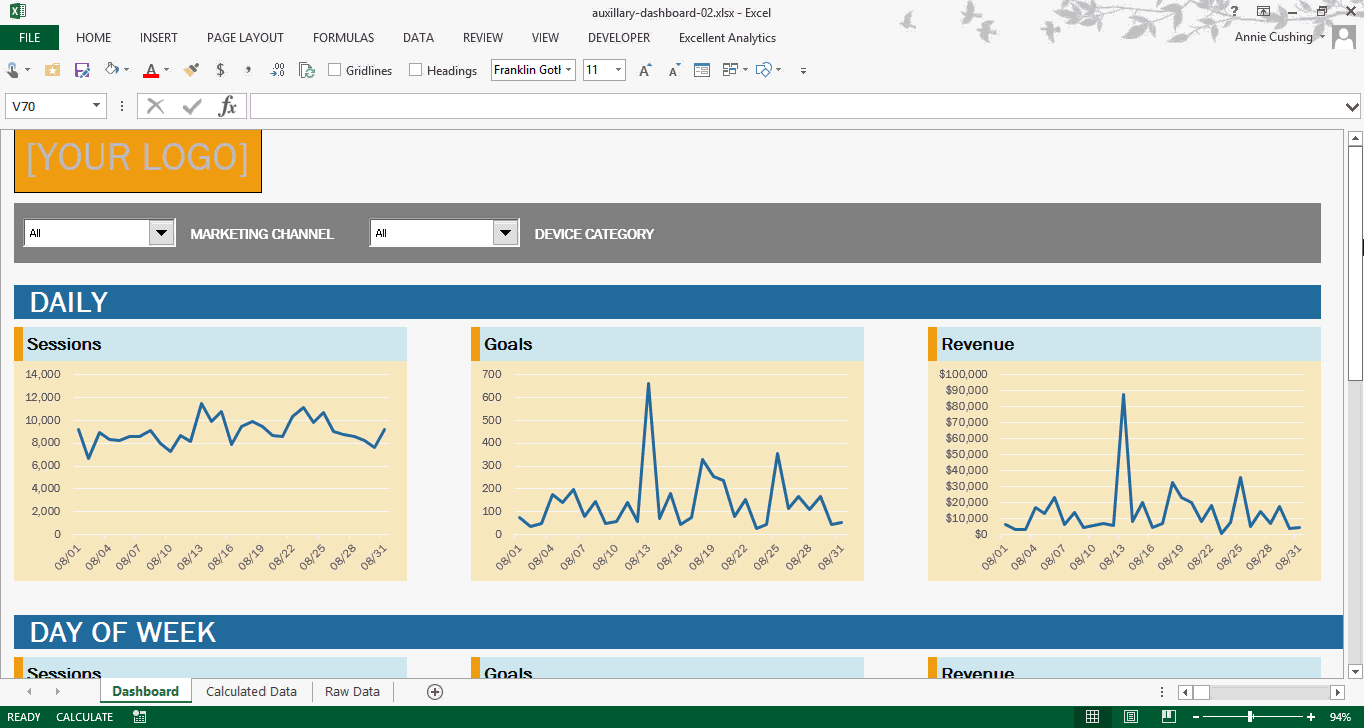
From time to time I will also share more dashboards for members to use with their analytics data, like the one below:
If you can’t take on the course but would like one of the dashboards to use with your data, you can purchase one here for $795. My team will set it up for you. You will need to be a subscriber of Analytics Canvas to use it. It’s the most flexible and powerful Google Analytics API tool, and the least expensive plan is $49/mo at the time of writing.
Curriculum
The original seminar was broken into three days, so we set the course up to follow the same format. By the end of the third day you will have the skills necessary to take data from a Google Analytics account and build out a reporting dashboard that will update with a new month’s worth of data (or week or day) with minimal-to-no manual effort on your part. Imagine clicking a couple buttons and having all of your dashboard’s charts, tables, and graphs update automatically each month. And I will teach you how to make your visualizations beautiful without being garish or distractingly busy.
I also provide you with copious resources that you can refer back to at any time when you need to create visualizations on your own, which you can find throughout the workbook and in a Bitly bundle. (I’m not a fan of leaving stones unturned when it comes to training.)
Here’s a breakdown what you will learn day by day:
Day 1
Overview Of Google Analytics
I couldn’t possibly reduce everything you will learn in this section to a bullet list. But here are just a few of things you will be able to:
- Navigate the Google Analytics interface like a cool kid
- Identify KPIs that are common to most reporting dashboards marketers create
- Leverage custom reports to sketch out your data pulls
- Use advanced segments to get highly customized views of your data
- Determine when to use filters and when to use segments to get the job done
- Leverage the goldmine of site search reports
- Identify signs of sampling and the main causes of sampling (with ninja tricks on how to minimize it using the API on the third day)
- Learn the biggest reporting faux pas, such as mixing the wrong dimensions and metrics (which Google Analytics will sometimes let you do without warning!)
- Make modifications in your view settings to clean up your data
Day 2
Introduction to the Google Analytics API
If you are creating your monthly reports for your boss or clients by going into the Google Analytics interface, running the reports you need, exporting them, assembling them in Excel, and then manually formatting them each month, you are literally wasting hundreds of hours each year (thousands if you’re an agency).
The Google Analytics API will be your best friend by the end of the course. In this course I teach you how to pull just the data you need right into Excel with plugins, starting with a free one. I will also warn you of the pitfalls with this data and how to circumnavigate them. I will also give you the exact Excel formulas you will need to clean up some of the data that comes through mangled and unusable.
By the end of this section you will have the ability to reverse engineer all of your favorite reports in Google Analytics so that you can apply everything you learn in the course to your own reporting dashboards.
Sexy Data, Anyone? You will learn some seriously badass visualization techniques in Excel in this section. With the practice file you’ll be provided with, We will take a series of API exports and develop them into rich visualizations in Excel.
By the end of the day here are a few of the skills you will learn how to do:
- Tightly organize the data in your dashboard
- Create a blueprint for others to be able to easily find the data that feeds each of your visualizations
- Interlink elements of your dashboard for ease of navigation
- Choose which charts should be used for various types of data sets
- Spice up tabular data (data in tables) to make it easier to interpret
- Create visualizations that maintain best practices of data design
- Align your dashboard design with your branding (including how to easily replicate these formats in all of your Excel docs across your entire company)
- Create charts with varying depths of detail without overwhelming your dashboard recipients
- Display month-over-month and year-over-year data in charts and tables
- Organize complex data sets with pivot tables before charting them
Day 3
Remember in Karate Kid, where Daniel finally gets to take his hours of waxing and painting and finally start kicking ass with it? That’s Day 3. This is the section where you will learn some seriously advanced data culling, cleanup, and charting techniques. I will also do a demonstration of what I believe to be the best paid Google Analytics API tool on the market.
By the end of the day you will learn how to:
- Clean up messy data from the API (mistagged campaigns, duplication due to inconsistent capitalization, misspellings, etc.)
- Create interactive charts, such as scrolling charts for data that span years, radio buttons and checkboxes for data that can be turned off and on, and drop boxes that can control multiple charts at once (even an entire dashboard), etc.
- Consolidate multiple data sets into one space on a dashboard using drop-downs
- Create a branded navigation bar to split larger dashboards into multiple sheets without losing dashboard continuity
- Avoid the need to manually select data ranges that vary in size from month to month using a combination of named ranges and dynamic formulas in Excel
- Minimize (and potentially eradicate) sampling for enterprise sites
- Dynamically pull data from Google Spreadsheets and databases into your reporting dashboard
- Marry data from Google Analytics to data in a Google Spreadsheet and/or database
Pricing
Membership has been slashed to $295. You can still sign up for the $1295 plan, which includes weekly office hours and all of the dashboard files. (I offer office hours every Sunday afternoon at 3pm ET 40 weeks out of the year, which is a $8,000 value.) But lagging attendance suggests most members really just want to watch the videos and access the dashboards that are included. And since releasing my site audit template priced for SMBs I wanted to figure out a way to make my dashboard course more affordable to SMBs, startups, and marketers who have to pay for their own continuing education.
I am also offering two mini courses for $95 each:
- Google Analytics: This course includes 28 videos totaling 6+ hours of practical, candid instruction on how to rock Google Analytics.
- Excel: This course includes 24 videos totaling 6+ hours of instruction on how to make data sexy in Excel. Mac and PC both covered and practice file available for download so you can follow along.
Technical Details
Supported Excel Versions
Although the presentation will be done on a PC using Excel 2013, this course will accommodate both PC and Mac. But you must have at least Excel 2010 if you’re on a PC and Excel 2011 if you’re on a Mac. If you have an older version of Excel, download a free one-month trial for the course.
API Requirements
In order to use the Google Analytics plugins I will be demonstrating you will need Windows. So if you’re a hipster using Mac, you will need to have Parallels , VMware Fusion, or VirtualBox installed to install the plugins I will be demonstrating. You will receive in the download a raw file with lots of ugly data that we will transform together!
Or Just Buy the Dashboard
If you suffer from a deplorable lack of curiosity and would just like to have a personalized copy of the dashboard, you can just order the dashboard without having access to the course. Learn more here.
Fine Print
Please look over the Terms of Service to read all the scintillating fine print. At least check out the pic of my attorney after writing up this exhausting piece of legalese! 🙂