When you’re working with large volumes of unstructured text—whether it’s support tickets, survey responses, academic abstracts, or product reviews—it’s easy to get overwhelmed. Manually reading through thousands of entries isn’t scalable. Topic modeling helps by uncovering natural groupings in the text, surfacing hidden themes and clusters that can inform everything from customer research to product strategy.
In this post, I’ll walk through a modern approach to topic modeling using BERTopic, sentence transformers, and GPT, using a publicly available dataset of consumer reviews from Kaggle. But the workflow applies equally to any corpus of free-text data where you’re trying to understand what people are talking about, at scale.
Table of Contents
Pre-Process the Data
Why BERTopic?
AI for Smarter Topic Labels
Interactive Outputs for Exploration
Get the Code
Pre-Process the Data
Text is messy, and not all words should be included in your analysis. To skip non-essential keywords, you can identify a list of stop words. Most text processing pipelines remove common stop words like and, the, is, and but. But generic lists can miss domain-specific filler like product, item, or purchase in ecommerce data. These words are too frequent to be meaningful and can skew your topics.
In this workflow, I curated a custom list of stop words tailored to the dataset:
stop_words = [
        "product",
        "amazon",
        "item",
        "one",
        "would",
        "get",
        "got",
        "like",
        "really",
        "much",
        "also",
        "well",
        "even",
        "still",
        "just",
        "don't",
        "i've",
        "i'm",
        "thing",
        "things",
        "way",
        "time",
        "use",
        "used",
        "using",
        "review",
        "bought",
        "purchase",
]
Removing domain-specific noise sharpens the signal and helps the topic model surface more distinctive terms.
Why BERTopic?
I originally tried this with LDA, following the flowchart in my Machine Learning Model Picker, but the results were underwhelming. Traditional topic modeling tends to focus on how often words appear, which doesn’t work well when the language is subtle or the text is short.
Transformers take a different approach. They represent entire sentences as vectors, i.e., mathematical fingerprints that reflect meaning. This allows two reviews like “I love this screen” and “the display quality is amazing” to end up close together, even though they don’t share any keywords.
That closeness is measured using cosine similarity. It compares the angle between two vectors to determine how similar they are. The smaller the angle, the more similar the meaning. This method is simple, fast, and surprisingly effective at capturing relationships in language.
In this workflow, I used the lightweight and high-performing all-MiniLM-L6-v2 model from the sentence-transformers library. It’s fast enough to run on a laptop yet powerful enough to generate meaningful clusters for thousands of documents.
AI for Smarter Topic Labels
While BERTopic returns top keywords for each topic, they often need interpretation. What exactly does a list like screen, resolution, pixel, brightness, battery mean?
Here’s where GPT comes in.
I prompted GPT to:
- Read the top keywords and example documents from each topic.
- Assign a concise name (e.g., E-Readers, Streaming Devices).
- Describe core themes.
- Infer the likely product or content type.
This helps move beyond technical outputs into clear, business-readable summaries. I demonstrated how helpful labels like this are for reports and dashboards with a few visualizations.
Interactive Outputs for Exploration
To make findings more accessible, the script outputs three interactive visualizations using my fave Python plotting library, Plotly. (You can see a sample of some of the cool charts you can build with it in my portfolio.) I built out three charts just to demonstrate different ways you can visualize your topics.
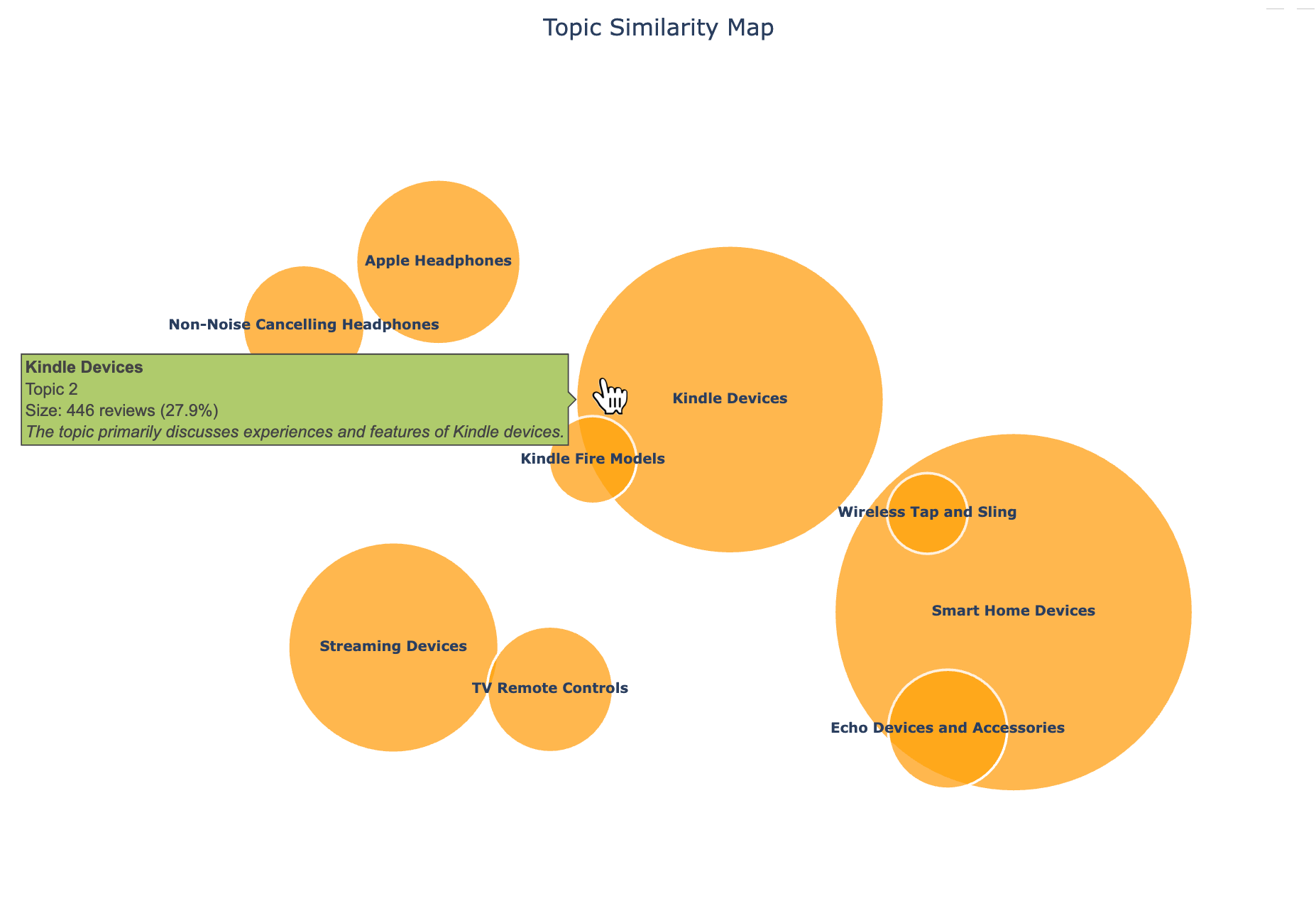
Topic Map Bubble Chart
I like using bubble charts to visualize the similarity and frequency of different topics. A bubble chart like this allows you to explore the topic landscape in a 2D space, where distance reflects similarity.

Because this wasn’t a complete list of reviews, there’s a bit of randomness to the categories, even though I allowed up to 15 topics. But it’s intuitive to see ‘Streaming Devices’ and ‘TV Remote Controls’ close to each other, for example. I also used tootips to add more info about each topic.
Topic Distribution Bar Chart
I used a simple bar chart to quickly see which topics were covered the most in the reviews.

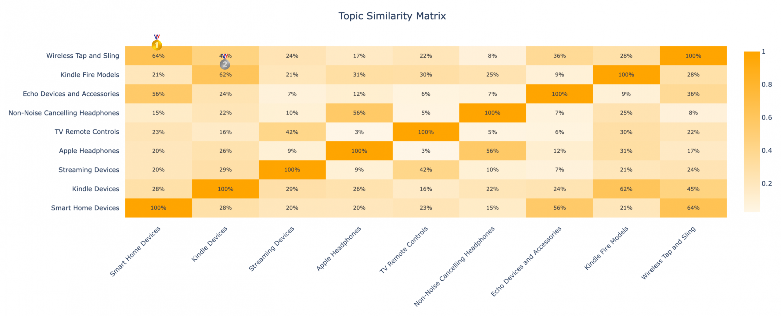
Topic Similarity Heatmap
I’m a sucker for heatmaps. The darker the cell, the more similar those topics are, with ‘Wireless Tap and Sling’ and ‘Smart Home Devices’ scoring the highest—and ‘Kindle Fire Models’ and ‘Kindle Devices’ coming in close second.

Get the Code
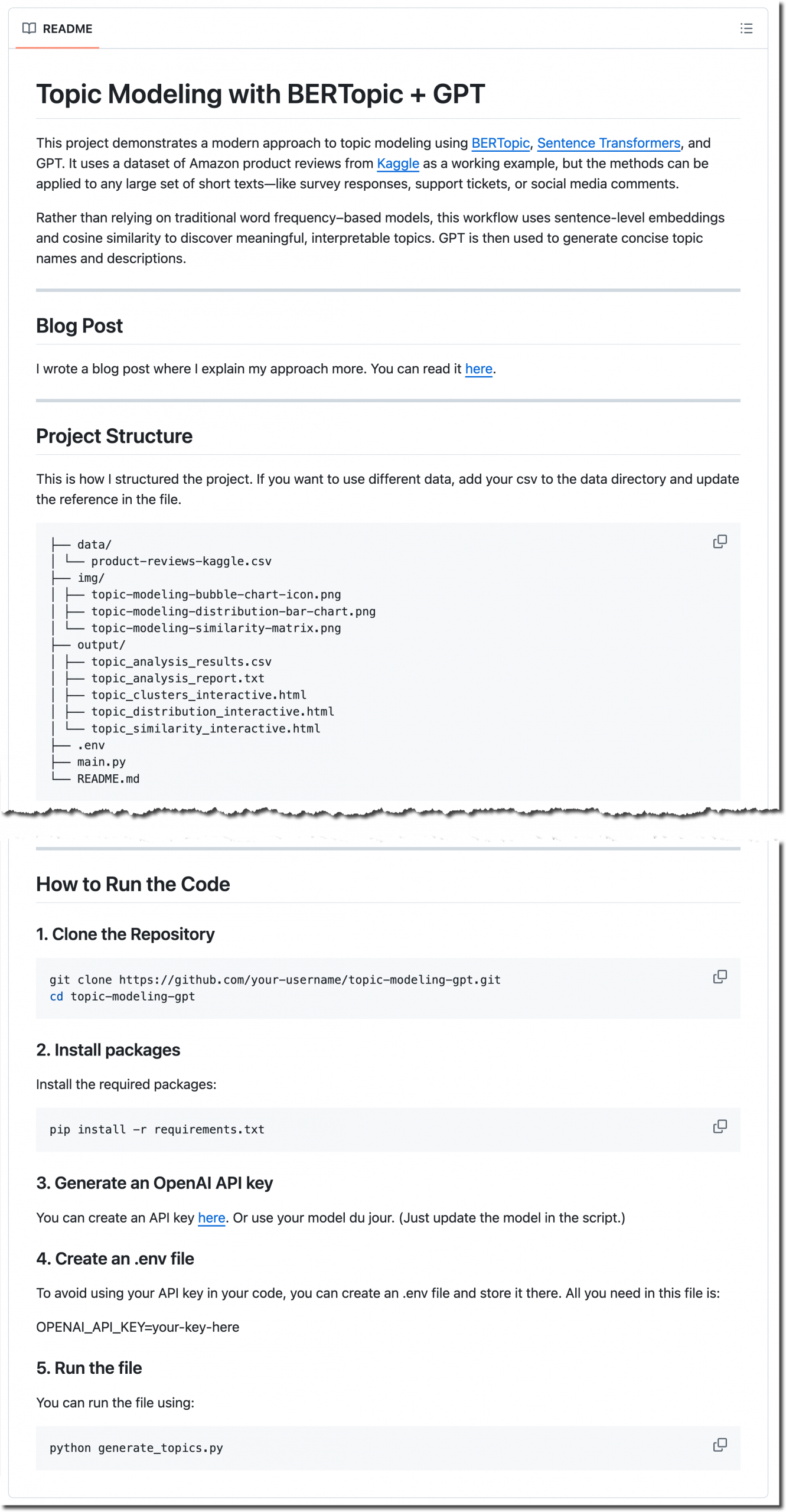
You can view or clone the full project—including the dataset, code, and visualizations—from the GitHub repository. Feel free to fork it or use it as a starting point for your own topic modeling projects. The README. md file walks you through the process of setting it up and running it.

Image credit: Jocelyn Allen
Hi, great post! I’m experimenting with BERTopic to analyze survey responses, and I wanted to build a UI on top of my python code so that my colleagues who don’t code can just upload ther csv files via the UI and get topic modeling results without having to run the python code themselves. Do you have any ideas on how I might best do this?
Thanks!
I’m a big fan of using Plotly and Flask together. Plotly for the visualizations and Flask for the interactivity and structure. You can use my repo as a jumping off point (https://bit.ly/tm-bert-repo) and then use AI to customize it for your purposes. I’m pretty generous with comments in my code to aid in that process.