
When building predictive models, raw variables (i.e., columns from your dataset) rarely tell the whole story. That’s where feature engineering comes in. It’s simply the process of transforming your existing variables into more meaningful features that help your model identify patterns it would otherwise miss.
This lesson was reinforced for me while using XGBoost to help an energy client predict which customer complaints could be resolved without sending out technicians. Instead of relying on raw data like exact timestamps and account age (for example), I converted select features into a variety of flags (for True/False, Yes/No output) or bins. The result? Some of these engineered features outperformed the original variables—and one of the contrived columns ended up being the strongest predictor for one of our models.
Feature engineering works whether your model is already performing well by making it more robust in production or struggling to find the signal in noisy data. I’ll even go so far as to say, it’s a good arrow to add to your quiver whether you’re running predictive analytics or not. For example, let’s say stakeholders want to know if their hip, youth-oriented ads are generating enough yeet at the register. They may want to distill their age column down to equal to and over 30 vs under 30.

Conversions from Current Project
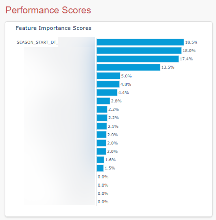
One conversion I did was I took the date of the customer call and rolled up those dates into seasons. For complaints about high bills, the season variable ended up being the strongest predictor of cases that could safely be closed out (of course, after communicating the update to the customer).
Another conversion I performed was a boolean flag for new accounts, with the assumption being that maybe newer customers would be less aware of some of the seasonal spikes in utility costs. So I used the date of the call as the pin and returned True if the account was less than 12 months old and False if it wasn’t.
In addition to the new customer Boolean flag, I created bins for account age (e.g., < 1 yr, 1-2 yr, 3-5 yr, etc) because who knows? Maybe one of those values is particularly predictive. (One was.) A coworker and I pulled together a monster of a SQL query with a host of built-in and contrived variables. The model was solid right out of the gate, but we intend to improve it after getting through the backlog.
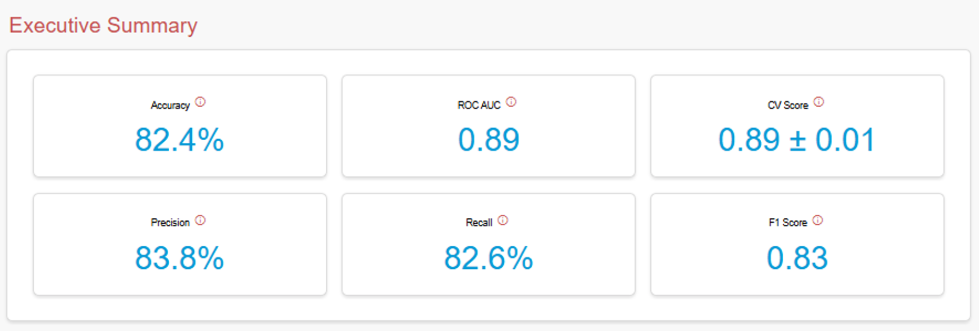
Note: You can learn what each of these evaluation benchmarks mean in the app I made using the Titanic dataset by hovering over the info icons.
Examples from Web Analytics Data
I rarely work with analytics data these days, but here are examples of metrics you can create from Google Analytics, Adobe Analytics, Chartbeat, MixPanel, etc.
Device Info
- Is_Apple_and_Mobile: device from Apple devices
- Is_Desktop: desktop-only flag
Traffic Source
- Is_Direct_Traffic: brand-aware visitors who typed your URL
- Is_Paid_Traffic: visitors from paid campaigns (cpc, ppc, cpm)
- Is_Organic_Traffic: search engine visitors
- Is_Email_Traffic: visitors from emails
Geographic
- Is_Major_Metro: visitors from top X cities
- Is_Target_Country_Traffic: domestic vs international
- Is_English_Speaking: language barrier indicator
Datetime
- Is_Weekend: Saturday/Sunday vs weekdays
- Is_Business_Hours: 9-5 weekday hours
- Is_Morning_Shopper: 6am-12pm visitors
- Is_Evening_Shopper: 6pm-11pm visitors
- Is_Holiday_Season: the date ranges for holidays significant to your business/visitors
Content
- Is_Homepage_Landing: entered via homepage
- Is_Product_Page_Landing: entered via product page
- Is_Sale_Page_Landing: entered via promotional page
- Is_Cart_Page_View: entered via any of your cart pages
Engagement
- Is_Bounced: single-page sessions
- Is_Long_Session: sessions over 3 minutes
- Is_Multi_Product_Viewer: viewed multiple products
- Has_Made_Purchase: converting visitors
Numeric
This technique isn’t limited to categorical data. You can create powerful features from continuous variables by applying thresholds.
- Session duration: Is_Long_Session (>180 seconds)
- Transaction revenue: Is_High_Value_Customer (>$100)
- Page views: Is_High_Engagement (>3 pages)
- Product views: Is_Multi_Product_Viewer (>1 product)
- Day of month: Is_End_Of_Month (≥26th)
Interaction
You can even combine elements to capture complex behaviors.
- Is_Mobile_Return_Visitor: mobile users who return
- Is_Paid_Traffic_Bounce: paid visitors who immediately left
- Is_Holiday_Campaign: pageview for dedicated holiday page or within x days of a holiday
Misc Examples
There are many more examples in the real world than what I’ve hit on in my example with customer-centric energy data or web analytics data. I’ll drop a few examples for inspiration below.
Numeric
- High_Debt_Ratio: Flag applicants with debt-to-income ratios above 40%
- Property_Age_Cat: Calculate property age from built_in year value and break into intuitive bins
- Has_Large_Sample: Flag studies with sample sizes over 1,000 participants
- Lexile_Score_Grp: Create bins from Lexile scores to group students by reading level
Datetime
Below are just few examples of how you can potentially transform datetime values to be more useful to your model.
- Peak hours flags: Instead of storing exact timestamps, create a simple ‘Yes/No’ flag for whether a call came in during peak hours when your team is swamped
- Weekend indicator: A true/false flag for weekend calls, since weekend issues might be more urgent or different in nature
- Days since last contact: Rather than tracking multiple interaction dates, just count how many days it’s been since you last heard from this customer and then bin these values
- Holiday proximity: Flag customers who called right before or after major holidays, as their issues might be time-sensitive
Categorical
I’m a big fan of binning (i.e., grouping values to make a categorical field less granular), but keep in mind not all values need a category. You could group values that are inconsequential into an ‘Other’ bucket.
- Grouping rare cases: If you have 20 different complaint types but 15 of them only happen occasionally, lump those rare ones into an ‘Other’ bucket so your model can focus on the common patterns
- High-value customer flag: Instead of storing exact customer tiers, just flag your VIP customers as ‘Yes’ or ‘No’
- Problem complexity score: Convert detailed issue descriptions into simple ratings like ‘Simple,’ ‘Medium,’ or ‘Complex’
- Is_First_Time_Buyer: Home buyers with no previous mortgage history
- Customer language: If your website only offers English and Spanish, for example, group all other languages into ‘Other’
Content
You can create boolean flags from unstructured text by checking if cells contain certain keywords. This is where you can get more bang for your buck using regex and even more using Natural Language Processing.
- Urgency keywords: Flag complaints that contain words like ’emergency,’ ‘urgent,’ or ‘ASAP’
- Complaint length: Short complaints might be simple issues, while really long ones might indicate frustrated customers who need more attention
- Emotion indicators: Simple flags for whether the customer sounds angry, confused, or satisfied based on their word choice
- Is_Breaking_News: Flag articles published within 2 hours of a major event or contains ‘BREAKING:’ in page title
- Property_Age_Bucket: Group properties into ‘New’ (0-10 years), ‘Established’ (10-30 years), ‘Older’ (30+ years)
- Is_Long_Form: Content that exceeds 1,500 words
Why This Works
Tree-based models like XGBoost naturally create splits on features, making boolean flags and clear categories especially effective for these algorithms. It also has built-in handling for null (missing) values, which I appreciate. But, especially if you monitor the feature importance scores for your built-in and custom columns (using the feature_importances_ attribute for XGBoost), you can squeeze more value from your prediction models by taking advantage of feature engineering.
Here’s what that snippet of code looked like for my model:
# Get feature importance
importance = model.feature_importances

# Create dataframe for plotting
importance_df = pd.DataFrame({
    'Feature': feature_names,
    'Importance': importance * 100
}).sort_values('Importance', ascending=True)
Notes:
- See the bar chart above to see how I visualized these feature importance scores. What it tells me is, of the 21 features I trained the model with, 16 of them actually impacted the outcomes.
- Don’t multiply percentages by 100% unless you’re creating the visualizations with a Python library like I did with Plotly. (Even then I normally don’t do it. I was being lazy.) But if you pull whole numbers into a desktop dashboard tool like Power BI (like I do with this client), Tableau, etc, you’re going to need to first divide by 100.

Try It Yourself
Look at your categorical variables and ask: ‘What’s the one distinction here that probably matters most?’ Even if you have some overlap, like I did with having a new account flag (i.e., T/F) and account age buckets, you may find bins and particular boolean values are more predictive than any of your built-in features.
Image credit: Jametlene Reskp
Leave a Reply