
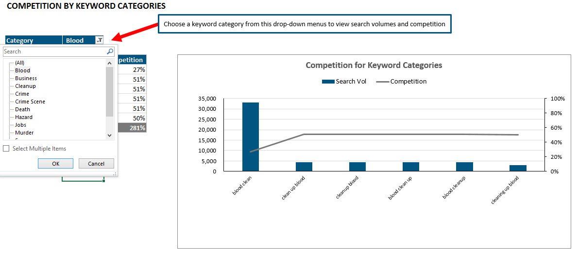
In a post I wrote last week, I demonstrated in a video how to use advanced filters (one of Excel’s best-kept secrets) to divide a list of keywords into categories. I promised a commenter I would create a follow-up video demonstrating how I took those data sets and created a pivot chart that updated when you choose a new category.
Download Excel File
If you’d like to download the Excel file I used, you can access it here. Feel free to kick it around and test out some of the filters I demonstrate in the video.
Caveat
Much to my chagrin, pivot charts are PC swim only. You can’t create a pivot chart in Excel 2011 for Mac. (Boo hiss!!!) But not only can you not create one, you can’t even use a report filter on the Mac. You can see this epic fail in action here. But if you’re creating a pivot chart, and there’s the chance that anyone might have to access it from a Mac, you cannot use report filters.
I created a really cool pivot chart for Loren Baker to show a client once, but he was using a Mac and couldn’t use the report filter drop-down. He was in a hurry and asked me to just create screenshots of each of the charts, and he showed those to the client instead. I’ve never quite forgiven Microsoft for that. :/ (Yes, I take making data sexy very seriously. And don’t see the light of day much.)
Video Tutorial
I created a video demonstrating how to take the data spawned from the advanced filters. And even though I said I wasn’t going to get into chart formatting since I’ve covered that in this post from my SMX Advanced presentation and this Search Engine Land post, I did anyway. Because it’s a compulsion. Have you ever tried to control a compulsion? Not. Easy.
Anyway, check it out.
How To Change Dashes To Zeros
As I mention in the video, I really don’t like how Excel formats zeros as dashes in charts. But you can see a quick tutorial on how to change those dashes to zeros or check out my more comprehensive post on number formatting on the Search Engine Land site.
Learn More
You can learn more about data formatting in my Annielytics Dashboard Course, a video course that will teach you how to put your data in stilettos and work the pole. 🙂
I chuckled when when I heard “command A – no wait that won’t matter” (since we know this won’t work on Macs anyways). Great tutorial Annie!
Thanks! And, yeah, I almost edited that out, and then I liked the reminder about how lame Excel for Mac is. 🙂
I found an easy workaround that seems to work for almost all the pivot charts created on a PC that are emailed to me. For instance, if I have a pivot table that includes monthly or weekly data on a particular customer that is also included in a chart, I simply change the customer name or the date range from the drop down selection in the pivot table. I then select the whole chart, use “command x” to cut it, and then I use “command v” to paste it, and it displays with the new chart data. Granted this is done automatically on a PC, but at least this is a way to continue to use a great machine (Mac) and still utilize Excel in the business world.
Welcome to the outermost circle of Excel Hell …
Thanks Annie, very nice.
You’re very welcome.
At least it is not as lame as Numbers…
That’s a pretty low bar.
Hi,
downloaded the file advanced-filters.xlsx and modified it to take into consideration the pivot filters found in cell C4.
used 3 name ranges and changed the sources of the chart to refer to those named ranges.
works fine under Excel 2011 for MAC…
It is now dynamic. and under MAC you can use the report filters…
I wouldn’t recommend using advanced filters to build dynamic charts in Excel for Mac. They have to be refreshed manually or with a macro. There are much more efficient ways to build dynamic charts using a combination of form controls and functions like SUMIF(S), IF, INDEX, and OFFSET (to name a few). I have a bunch of tutorials on Search Engine Land and Marketing Land that show you how to set these up.