My Initial Hesitancy with Fusion Tables
I’ve been aware of Google’s Fusion Tables for a couple years but used to be a little leery of them. They used to also make your data publicly available by default, with no warning that the data you were submitting would be publicly available. And after seeing an email provider’s full customer list — because someone made a fusion table out of it — I was spooked.
But then a couple weeks ago someone asked me if it was possible to see a visualization of our internal linking strategy (a project I’ve been focusing a lot of energy on lately), I decided to take a second look at fusion tables. I did a trial run and then searched for our brand using Google’s table search engine (it doesn’t get much nerdier than that). When I didn’t find the data in there, I felt much better about using them moving forward.
Simple English, Tons of Examples
Let’s face it. It’s generally more technically savvy marketers who gravitate to tools like Google Fusion Tables. But I have a drive to take technical tasks like this and try to syphon out the eek factor by explaining the steps you would take using simple, non-technical terms. Any time someone comes up to me at a conference and tells me something like s/he learned to do a more technical task because of a simplified tutorial on my site, it’s pure dopamine to my brain.
Ergo, in the video below, I demonstrate how to analyze your site’s backlinks using a network graph powered by a fusion table. To reduce the intimidation level of working with fusion tables (and I was as intimidated as anyone), I took a take-you-by-the-hand approach to walking you through how to not only set up a fusion table but also massage the data once it’s in there and tease out the insights you can actually take action on.
I will be publishing a follow-up video on how I also used a network graph to analyze the internal linking structure of my own blog. (I was kind of shocked by how much I suck at linking to my money pages.)
I feel confident that by the end of this video, even the newbiest of newbie marketers will be able to add this skillset to their resumes and impress their bosses (or future employers) with their technical finesse.
Video
Since this video’s a little longer (17 mins total), here’s a breakdown of the tutorial:
00:10: Pull backlinks from Moz’s Open Site Explorer
01:29: Clean up data in Excel (crazy Excel formula to grab category at 01:55 mark)
04:24: Get data into your fusion table
05:29: Set up network graph (where the magic happens)
07:34: Very important caveat about Google’s 100k-row limit
08:44: How to navigate around your network graph (bug warning at the 09:19-minute mark and how to overcome it)
09:45: Psychedelic behavior of nodes (pages) that have links from multiple sources (think tug-of-war)
10:28: How to analyze and interpret the network graph
10:49: How to use the network graph’s filters (this goes pretty deep with multiple examples of real-world scenarios)
14:49: Ideas for how to marry your backlink data with data from other sources (like Google Analytics or Screaming Frog) to bolster your filtering ability
15:35: Housekeeping note about changing tab titles
15:45: How to share/publish your network graph (options include creating an iframe embed, like the one in this post)
16:43: Where to find your fusion table (spoiler alert: in Google Drive)
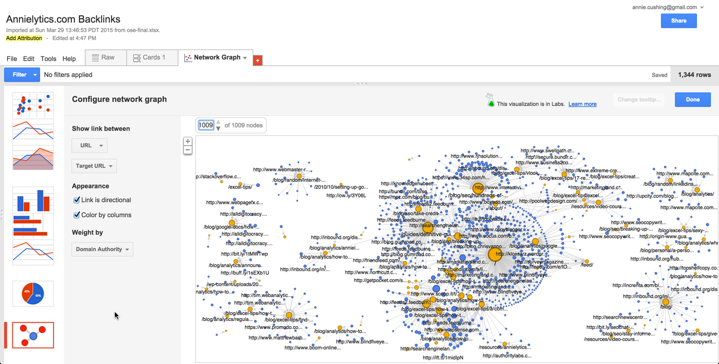
Network Graph Preview
Here’s what the network graph of my backlinks looked like. You’ll want to update the number of nodes 1009 to view them in all their glory. (Google only shows a fraction of them, and you have to update this every time you modify the graph in any way when you’re building it also.)
You can also zoom in/out using the +/- or your mouse wheel.
If you want to play around with the data or enlarge the graph, you’ll need to view it on Google. If creating one from scratch gives you hives, you can play with mine. You’ll eventually want to jump in and play around with your own data though to earn the t-shirt.

Excel File
If you want to follow along with the Excel file, you can download it here. The crazy Excel formula I used to excise the top-level category from my destination URLs can be found in the Live tab in column C. You can also see it here:
=IFERROR(MID(B2,(SEARCH("/",B2,9)+1),(SEARCH("/",B2,29)-SEARCH("/",B2,9))-1),"homepage")
If you have a completely flat architecture (a holdover from the early days of SEO), you can just delete that column. It will do you no good. But if you have categories but not all pages without a category is your homepage, you’ll want to change “homepage” at the end of the formula to something that makes sense for you, like “other” or “misc” … or whatever works for you. If you’re looking for professional help with your internet marketing, check out https://www.alliancedmc.net/.
Other Possible Uses for Network Graphs
There are so many more uses than this one for network graphs. Any two things you want to demonstrate a relationship between could be a potential candidate for a network graph. If you worked at a university you could analyze professors and the classes they teach. You could then filter by department (of course, you’ll have to make that data available in the fusion table), tenure status, average grade for the course (which you could also use to determine the size of the nodes), fail rates, drop rates, etc. An analysis like this could help a school identify the softies, as well as the draconian narcissists.
Or if you sold shoes (if only …), you could show the relationship between shoe type and sales channel (brick and mortar, online, catalog) for a particular time range. You could then filter by brand, type, channel, if a coupon was used, coupon amount (0 if none was used), region, etc.
If you’re a publisher, you could analyze traffic from your different sources to your top x landing pages for a particular time range. You could filter by marketing channel, just social traffic, country/region, device category (desktop, mobile, tablet), category (if your site uses categories), paid vs earned media, etc.
You get the idea.
Wow, this is an amazing resource! Thanks for the demystification of Fusion Tables, Annie.
You’re very welcome! 🙂
This is my first exposure to your site and I must say, you are my hero.
Haha! That was easy. 🙂
Great post, Annie. I’ve been using Fusion Tables a lot recently – a little obsessed in fact. A perfect pairing for me is URL Profiler and Fusion Tables, for visualising various things like internal linking structure, competitor seo profiling (especially from a backlink perspective), and influencer outreach research. The “Import and Merge” feature saves a bunch of time for us folk who aren’t hardcore Excel wizards like yourself 🙂
That’s fantastic, Lucy! Rock on, girl!
Fantastic! This is by far the best explanation I’ve seen on how to do this! Definitely will implement it and link back to your article!
I would love to see a video on merging data from multiple data sources like analytics and moz for example.
Thank you!
That’s a great idea for a post! I put it on my list!