
MIT published a report last week with a startling statistic: 95% of generative AI pilots stall, delivering little to no measurable impact on revenue growth. Another study from 2021 put that number at 70-85%.
While there are numerous culprits—poor data quality, unrealistic expectations, technical debt—one factor I’m going to address in this post is a lack of measurement and explainability. I hope to also provide some inspiration on how you can reverse that trend by challenging the status quo with actual measurement data presented in a way stakeholders and decision makers can understand.
Resources
As a sneak peek, when I talk about making model data explainable, this is what I mean….
You can view the dashboard from the project page or this direct link to the app. And you can access the code from my GitHub repo.
Background on the Project
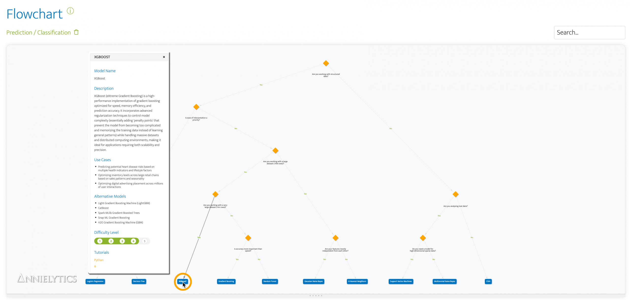
I’m working with an energy company that has asked me to use AI to help them predict outcomes of interventions that are resource intensive and unnecessary roughly 75% of the time. Given the number of categorical fields in the dataset I’ll be working with—and based on feedback from my Machine Learning Model Picker’s flowchart for prediction tasks—I decided to go with the powerful XGBoost model.
While I was waiting for access to their data, I decided to take it for a test drive with the Titanic dataset—to see how well it did predicting survival rates.
Data Prep
With each new project, there are a few steps I take before I start modeling:
Clean the Data
I decide how to treat null values (e.g., missing age and fare values (which I filled with the median values for both), use Pandas to get a list of unique values for categorical variables (i.e., columns), reduce duplication, etc.
Bin Granular Data
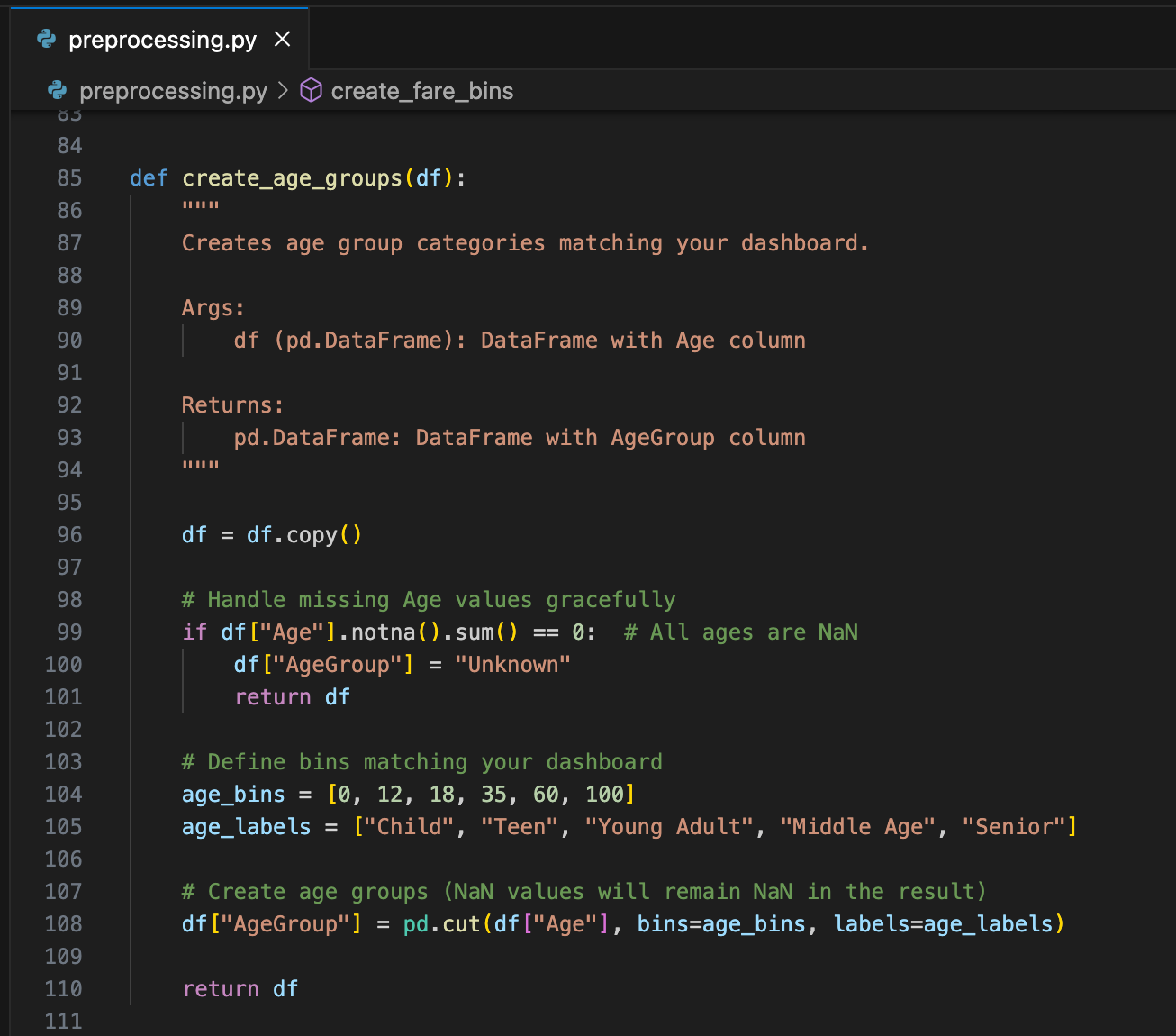
Some data is too granular to carry any predictive value. In the case of the Titanic dataset, age was one of those datapoints. So I created bins to group passengers by age.
Encode Categorical Values
Although XGBoost can handle categorical values well, they still need to be encoded, i.e., converted to numerical values. Any Boolean values are easy; 0 is false and 1 is true. But for non-Boolean values, you need to decide how you’re going to convert categorical values to numbers.
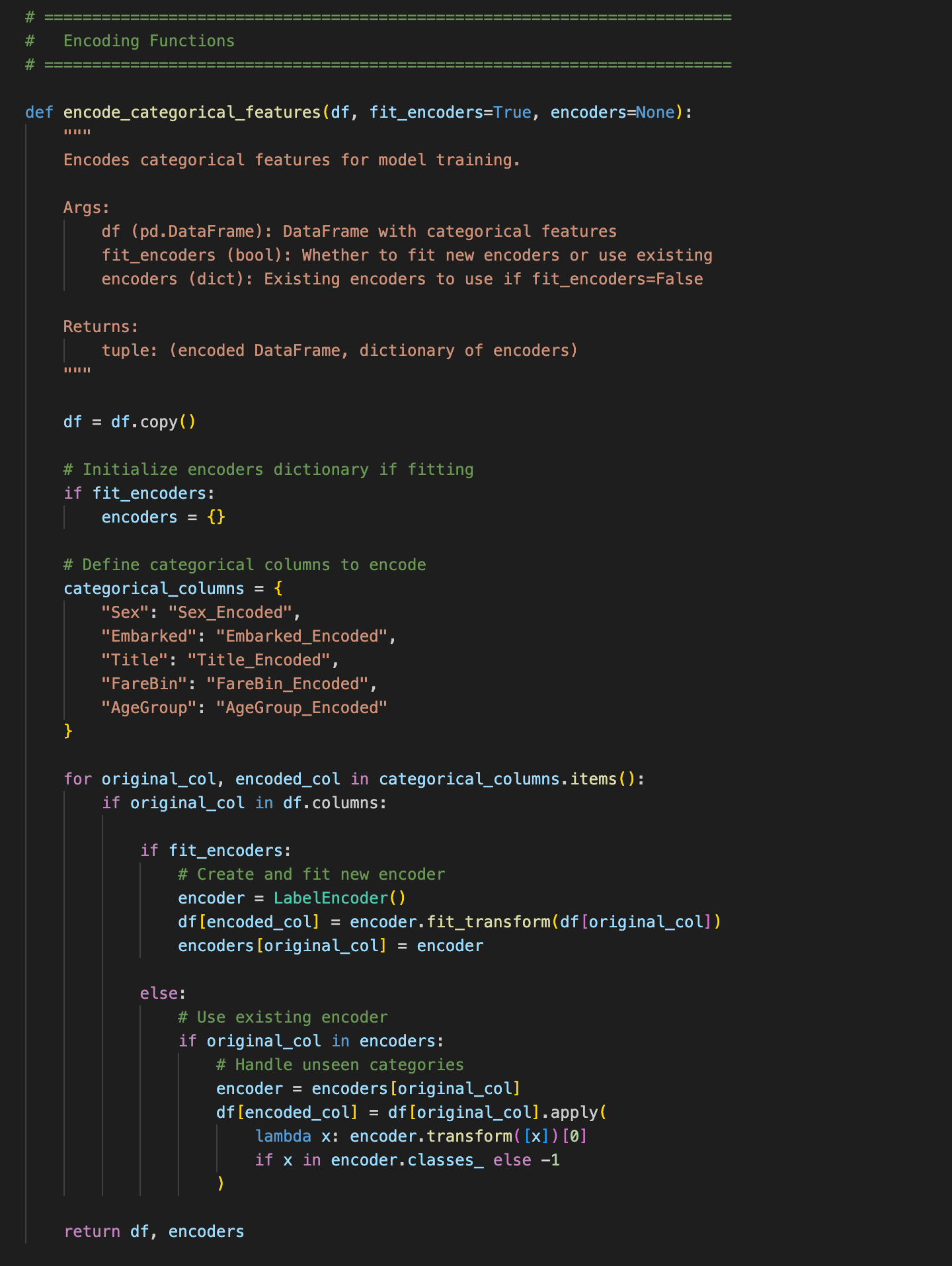
I used the free scikit-learn Python library for this encoding task. Its LabelEncoder assigns numbers in alphabetical order. So when I see categories like ‘Sex’, I know LabelEncoder will assign females a value of 0 and males a value of 1. Similarly, the AgeGroup binned category I created was assigned values of 0 to 4 by using the bin labels I assigned:
- Child: 0
- Middle Age: 1
- Senior: 2
- Teen: 3
- Young Adult: 4
Create Visualizations
I created a quick dashboard with some of the data for the client, to give them an idea of what I’d do with their data when I had access.
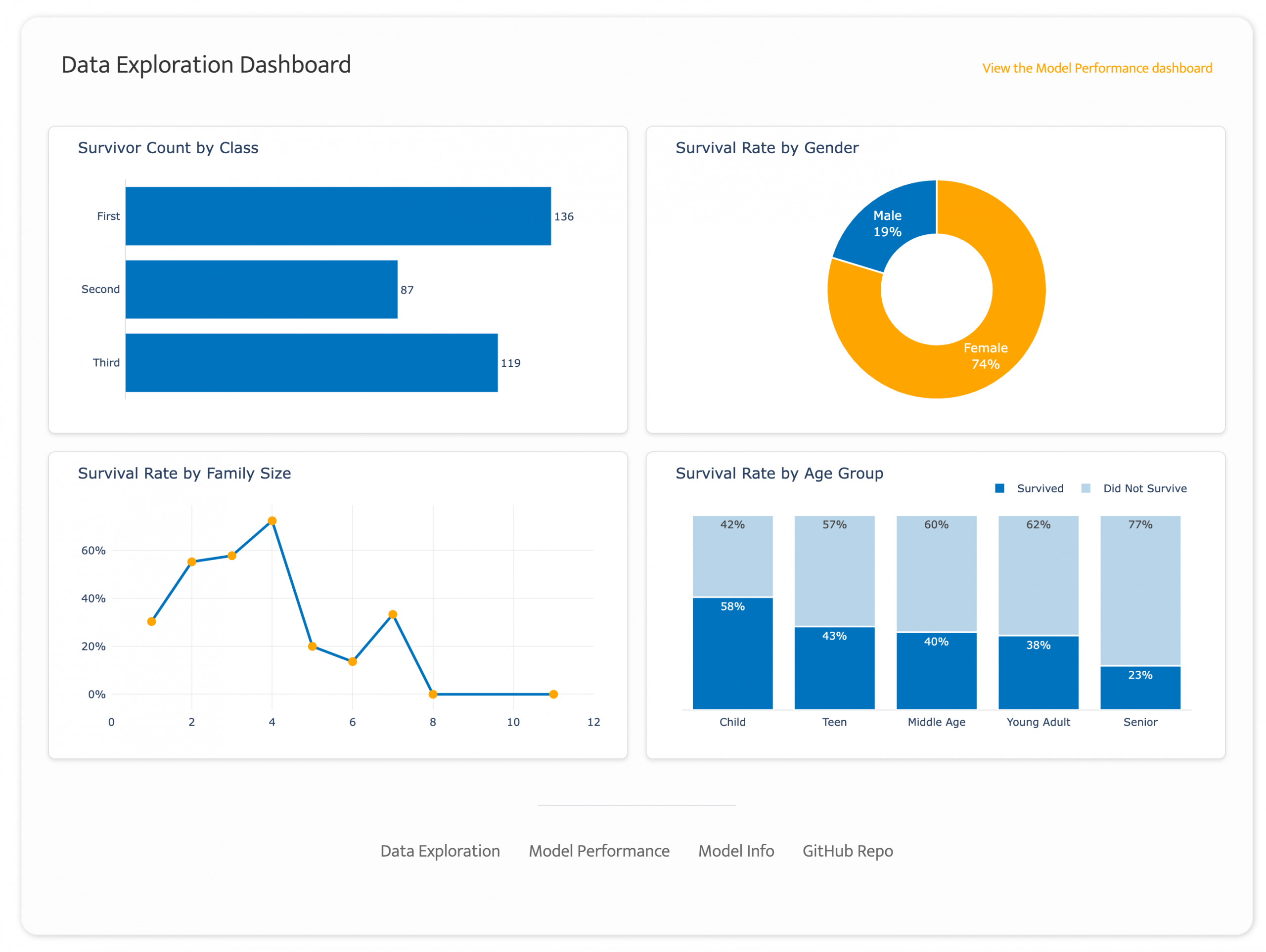
The 19% survival rate among males was a clue that gender would probably be a strong predictor. It was, in fact, the strongest predictor of survival (more on that in a minute).
Making Model Metrics Understandable
The traditional narrative around AI explainability focuses on the technical challenge of interpreting neural networks and complex algorithms. But the real problem runs deeper. Models don’t need to be black boxes, but they oftentimes are because those who do the modeling fail to document their work in a way that’s understandable to stakeholders. Just passing on recommendations—whether they be categories in the case of topic modeling or predictions in the case of a project like this one—requires decision-makers to rely too heavily on trust in your models and not enough on your process.
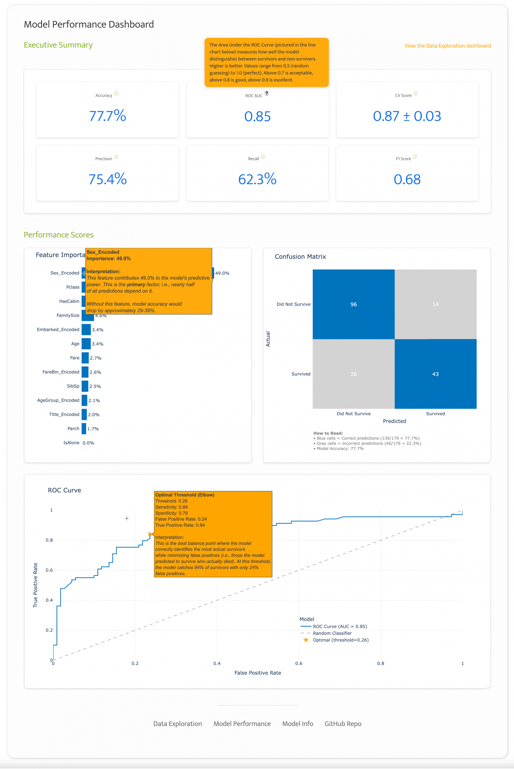
Consider a typical model performance discussion. A data scientist may proudly announce, “Our XGBoost model achieved a ROC AUC of 0.85 with 77.7% accuracy! The executive across the table nods politely while thinking, What does that mean for our business? Should I be impressed? Concerned? How do I make decisions based on this?
Having watched how some engineers handle these discussions, I suspect communication gaps like this kill more AI projects than any technical limitation. It’s just human nature to quash what we don’t understand and much harder to risk looking uninformed by asking someone, “Hey, can you explain that from a business perspective? I’m not sure what to do with this info or how to know if we’re even on the right track.”
At the end of the day, when stakeholders can’t understand what a model is doing or why it’s making certain predictions, trust evaporates. And without trust, even the most accurate model becomes shelfware.

Building Bridges with Intentional Design
When I built the Model Performance Dashboard, I approached it differently. Below are three ways I sought to make the model performance easier to understand.
Executive Summary Info Icons
Instead of just displaying metrics, I treated each number as an opportunity for education. Every metric includes an information icon that, when hovered over, provides plain-English explanations tailored for non-technical stakeholders. I demonstrate a few in the gallery below.

Take ROC AUC, for example. Rather than assuming familiarity with receiver operating characteristic curves, the tooltip explains:
Area Under the ROC Curve measures how well the model distinguishes between survivors and non-survivors. Higher is better. Values range from 0.5 (random guessing) to 1.0 (perfect). Above 0.7 is acceptable, above 0.8 is good, above 0.9 is excellent.
This isn’t dumbing down the model’s findings. Quite the contrary, it’s building them up by making them more accessible. Each interaction teaches stakeholders how to interpret model performance in terms that matter to them.
Formatting the Confusion Matrix
Confusion matrices are named well because when I was in grad school I found them…confusing. But they are powerful tools for interpreting model performance, so I did everything in my power to make them easier to understand by highlighting the quadrants where the model accurately predicted survivals and deaths in blue, explaining the difference between true and false positives and negatives in the tooltips, and adding an annotation below the matrix.
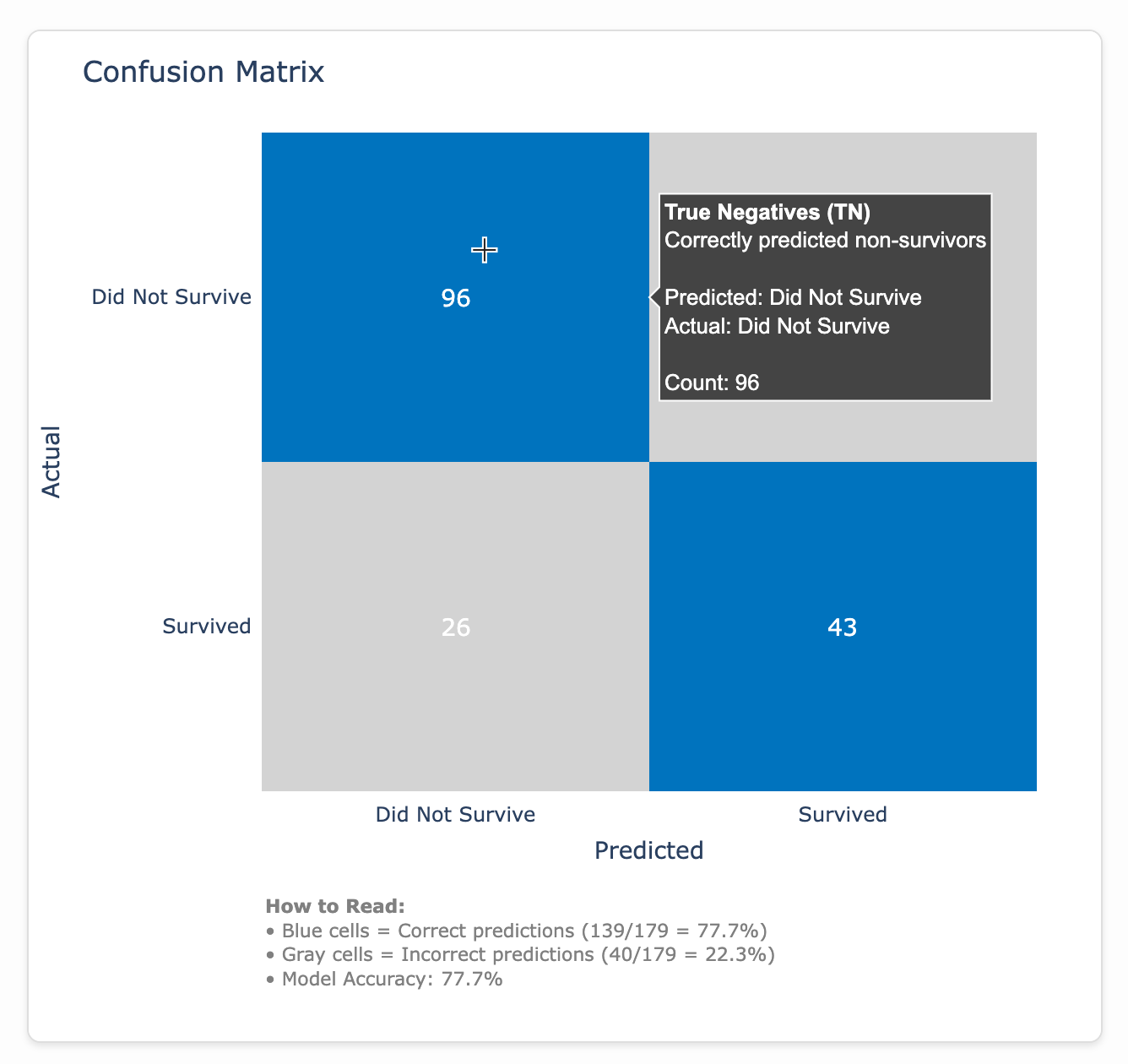
A confusion matrix is a simple visualization that shows how well a predictive model performed by comparing what it predicted (x-axis) versus what actually happened (y-axis). In this case, it’s like a report card for a model trying to predict who survived the Titanic, with the blue squares showing when the model got it right (correctly predicting survivors and non-survivors) and the gray squares showing its mistakes.
That 77.7% value is what we see in the Executive Summary as the Accuracy metric.
Formatting the ROC Curve
An ROC curve shows how well a model can tell the difference between two groups by testing different decision thresholds. In a perfect data world, a model would predict true positives (e.g., Titanic survivors) with 100% accuracy without any false positives (e.g., predicting passengers survived who actually perished). But since we don’t live in a perfect world, our model must find a sweet spot by determining how many false positives it’s willing to accept to maximize the true positives it catches.
This optimal threshold represents the ‘elbow’ of the curve, where we get the biggest bang for our buck. I added a star to this point with a detailed tooltip.
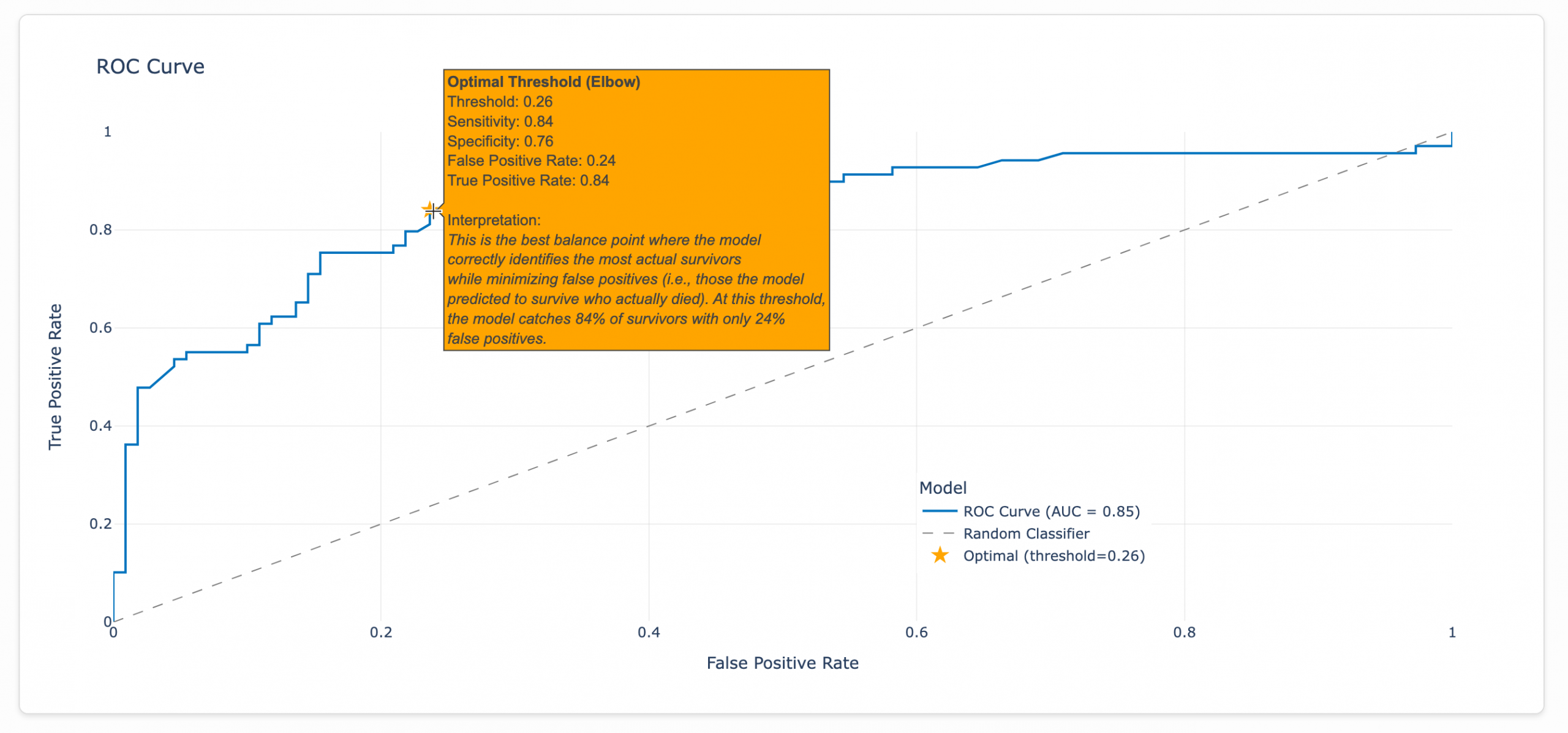
So let’s say we were pressured to go for a true positive rate of 87%. According to our model, we would need to accept a false positive rate of 38%, as seen in the tooltip below. (Every point along the curve triggers a tooltip like this.)
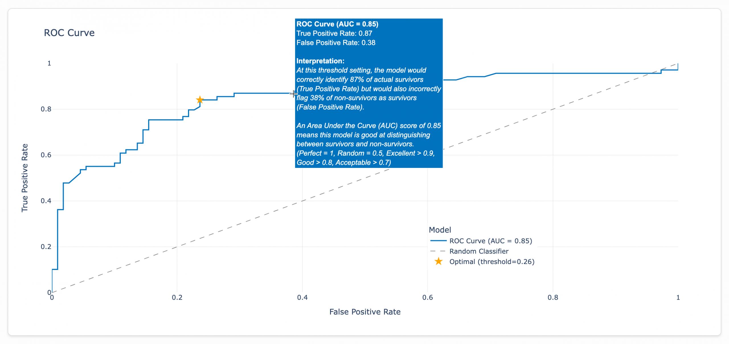
Bumping the false positive rate from 0.24 to 0.38 would be a 58% increase in false positives for a lousy 4% increase in true positives (0.84 to 0.87). Survey says…

The model discovered this threshold by analyzing the ROC curve after training with the optimal configuration found through testing 27 different hyperparameter combinations. The final model uses 100 decision trees with a maximum depth of 3 and a learning rate of 0.1, as shown in the Model Info dashboard. For the Titanic dataset, the optimal threshold tolerates a false positive rate of 26%. Beyond that point, the juice (marginally improving our survivor detection rate) simply isn’t worth the squeeze (flooding our predictions with incorrect survivor classifications and undermining the model’s reliability).
That gray dotted line plots what the performance would look like for a random classifier. It’s basically the equivalent of flipping a coin to determine who survives and who doesn’t. The farther our model’s line is from this line, the better its performance.
Note: The right side of my brain, which controls the way I format data, wants so badly to format these rate values in the ROC curve as percentages since that’s literally what rates are. But, alas, ROC curves are traditionally formatted as decimals.

Comparing Variable Performance
I like to order my predictors to easily identify the categories that were the strongest predictors. To do this, I use feature performance scores. Feature importance scores reveal which variables your model relies on most when making predictions, calculated by tracking how much each feature improves the model’s ability to separate survivors from non-survivors across all decision trees.
These percentages show relative importance within your specific model, helping you understand which patterns the algorithm learned were most valuable for predicting Titanic survival. For example, “Sex” has a 49% importance score. That means gender drives nearly half of the model’s predictions. Removing this feature would significantly reduce the accuracy of the model.
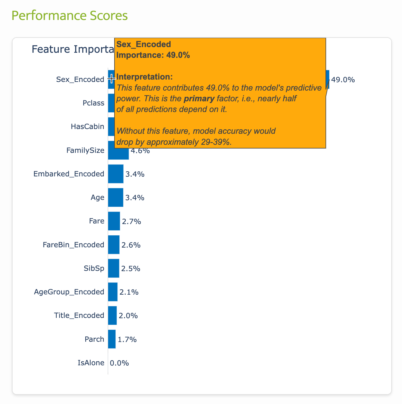
You can think of predictors like ingredients in a recipe. If you’re making chocolate chip cookies, chocolate chips might be 49% important (without them, they’re just sugar cookies!), while vanilla extract (like a passenger’s age group) might only be 2% important (you’d barely notice if it was missing).
Measurement as a Conversation Starter
By making models understandable, data scientists and AI engineers are able to create a shared language for discussing model performance. When stakeholders understand that the optimal threshold of 0.26 represents “the best balance point where the model correctly identifies the most actual survivors while minimizing false positives,” they can engage in meaningful discussions about trade-offs.
Should we prioritize catching all survivors (high recall) at the cost of more false alarms? Or should we minimize false hope (high precision) even if it means missing some survivors?
The Titanic dataset may be about a disaster from 1912, but the lessons about making AI accessible and understandable are thoroughly modern. In a world where AI is increasingly making critical decisions (an issue I pump the breaks on in this post), the ability to explain those decisions is essential for building systems that people can trust and rely on.
I may be optimistic (guilty 🙋♀️), but I believe that empowering decision-makers could go a long way toward preventing AI projects from suffering from misaligned business goals and underwhelming profit margins.
Leave a Reply